Netflix Programs - Exploratory Data Analysis
I use netflix a lot for my entertainment and binge watching - Usually wasting too much time by clicking suggested tv shows and movies😕.
Then i thought why not analyze netflix content dataset to see, if i can find any intersting stuff.
Downloaded dataset(https://www.kaggle.com/shivamb/netflix-shows) as of 2019 from kaggle and setup an conda environment with numpy, pandas and matplotlib for analysis and visualisation.
The complete notebook can be found here - https://www.kaggle.com/jpchinnaraji/netflix-data-analysis-and-visualizations/comments
Show/Movie release_year feature analysis
On Analysing the data, number of shows/movies has taken a extremley huge spike from the halfway mark in dataset. From 20 in 1980 to more than 1750 in 2020. This increase might be owing to the addition few reasons
- Content from different countries after the beginning of 2000’s - We can confirm this by analyzing
countryfurther - Content not saved due to less technological advancements during the time period
Plot’s visualzied based on the release year seperated at midpoint
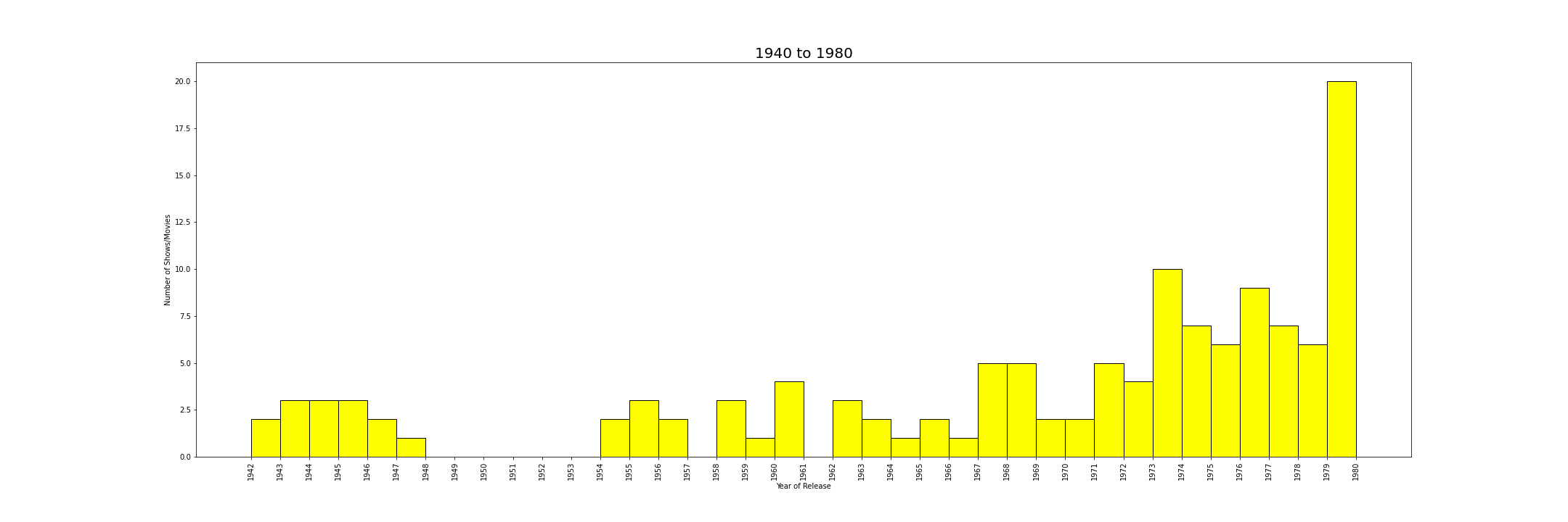
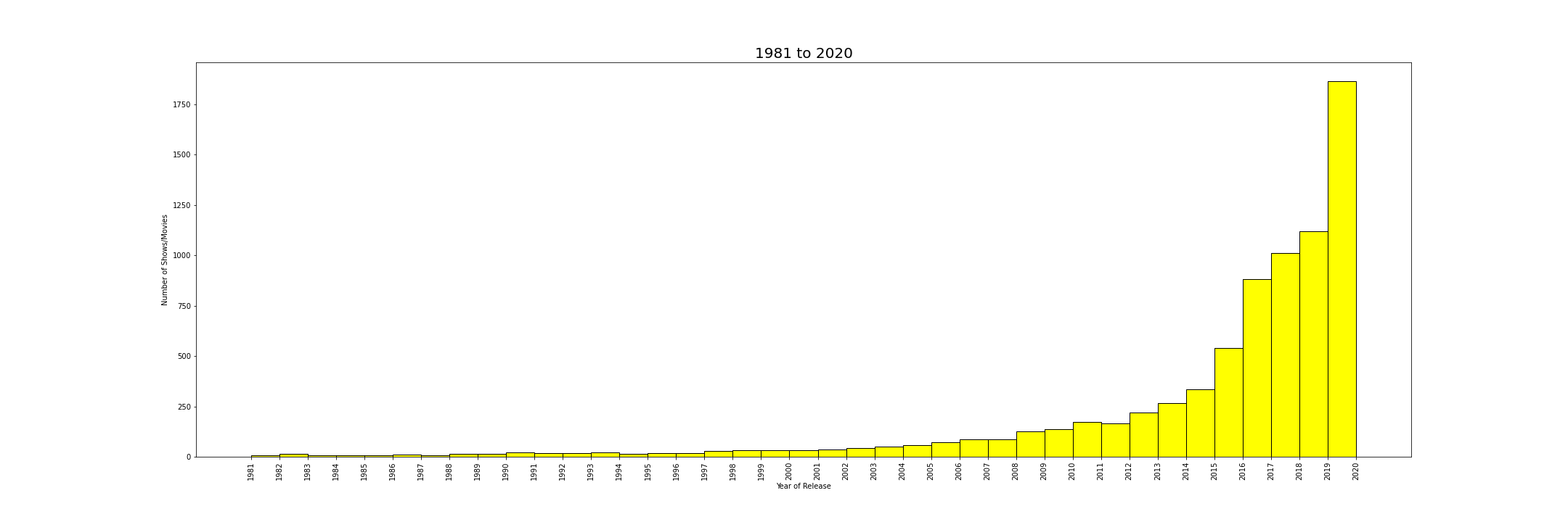
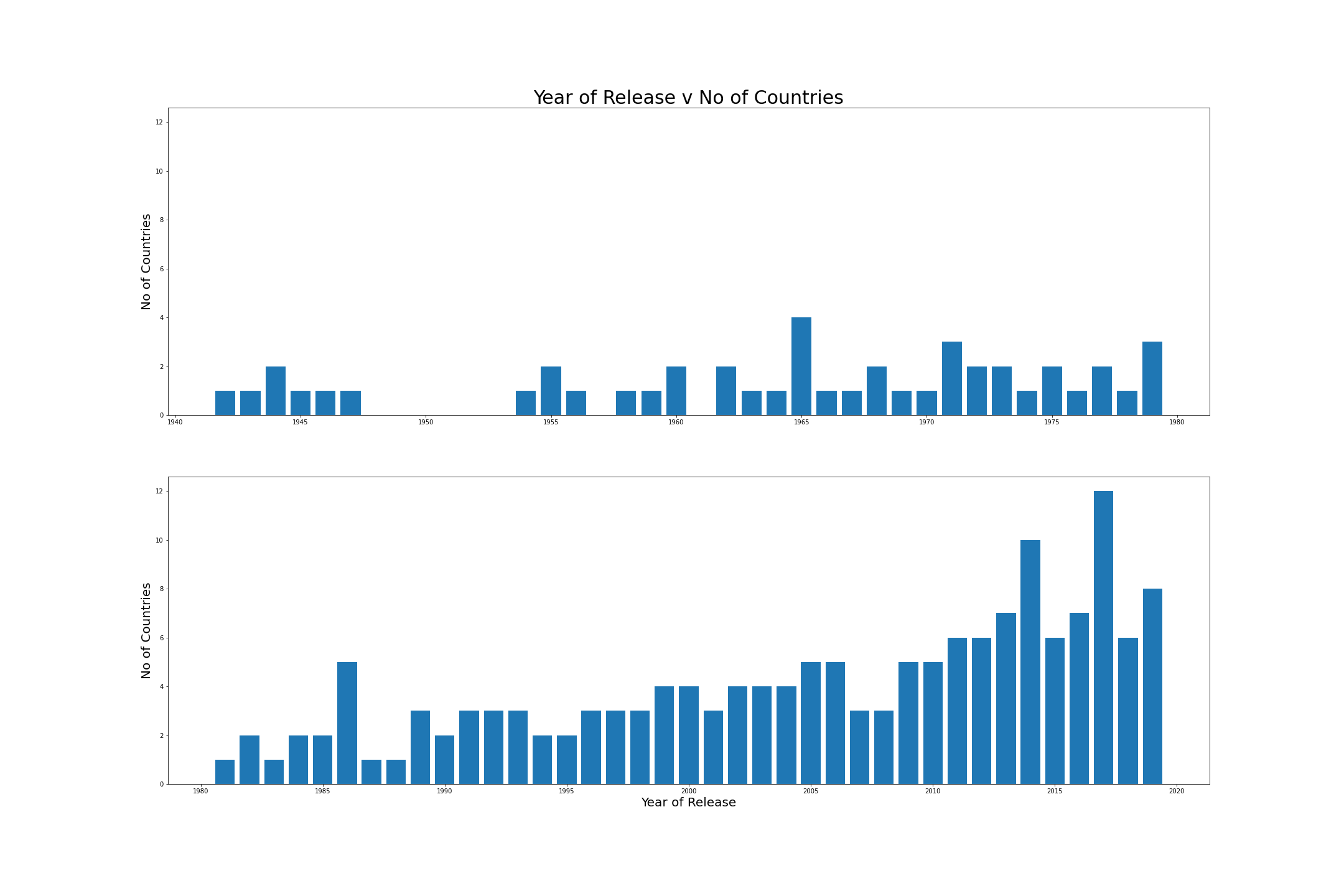
On analysing country feature, there’s not much correlation between year of release and number of countries.
On seeing the below graph the no of countries increased from a peak of 5 in first half to peak of 12 in second half which can be considered as gradual increase. We can confirm that older movies/shows available in netflix based on released years is less in first half due to techonlogy only.
Show/Movie year_added feature analysis
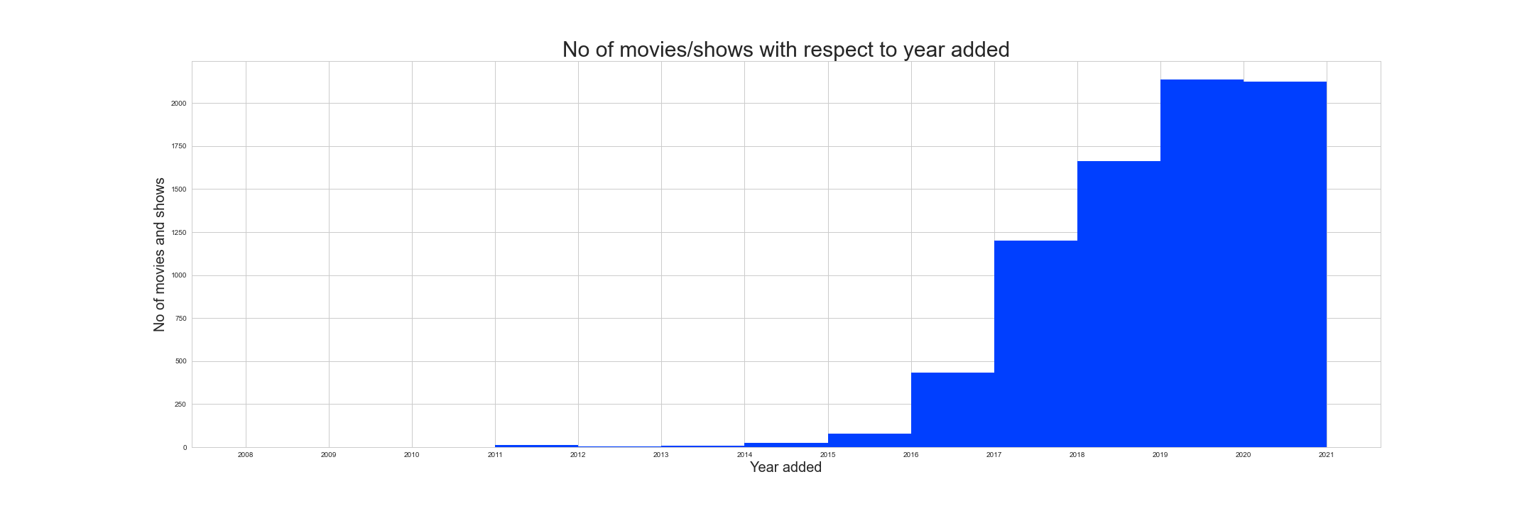
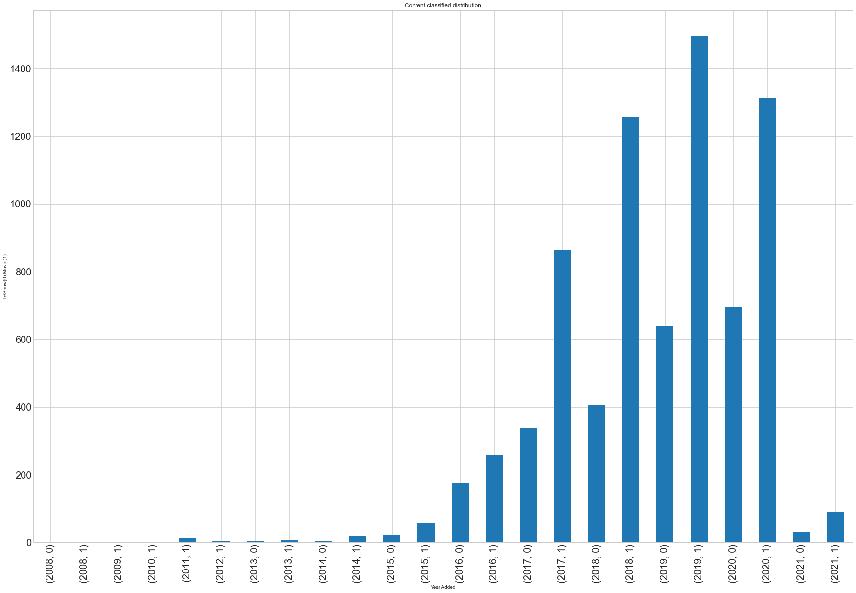
The contents were added to netflix from 2008. Number of shows/movies added were less from 2008 to 2010, then a break in 2011. New content were added for the next two years i.e 2011 and 201 and nothing until 2013. From 2013 to 2016 new contents were added gradually, then the addition of new contents increased exponentially from 400(2016-2017) to 1200(2017-2018) and this pattern is observed in further years.
Based on the addition of new contents, we can say netflix subscribers could have increased from 2015 and loads of additional content were added to attract more subscribers for the platform.
Visualized plot
Show/Movie month_added feaure analysis
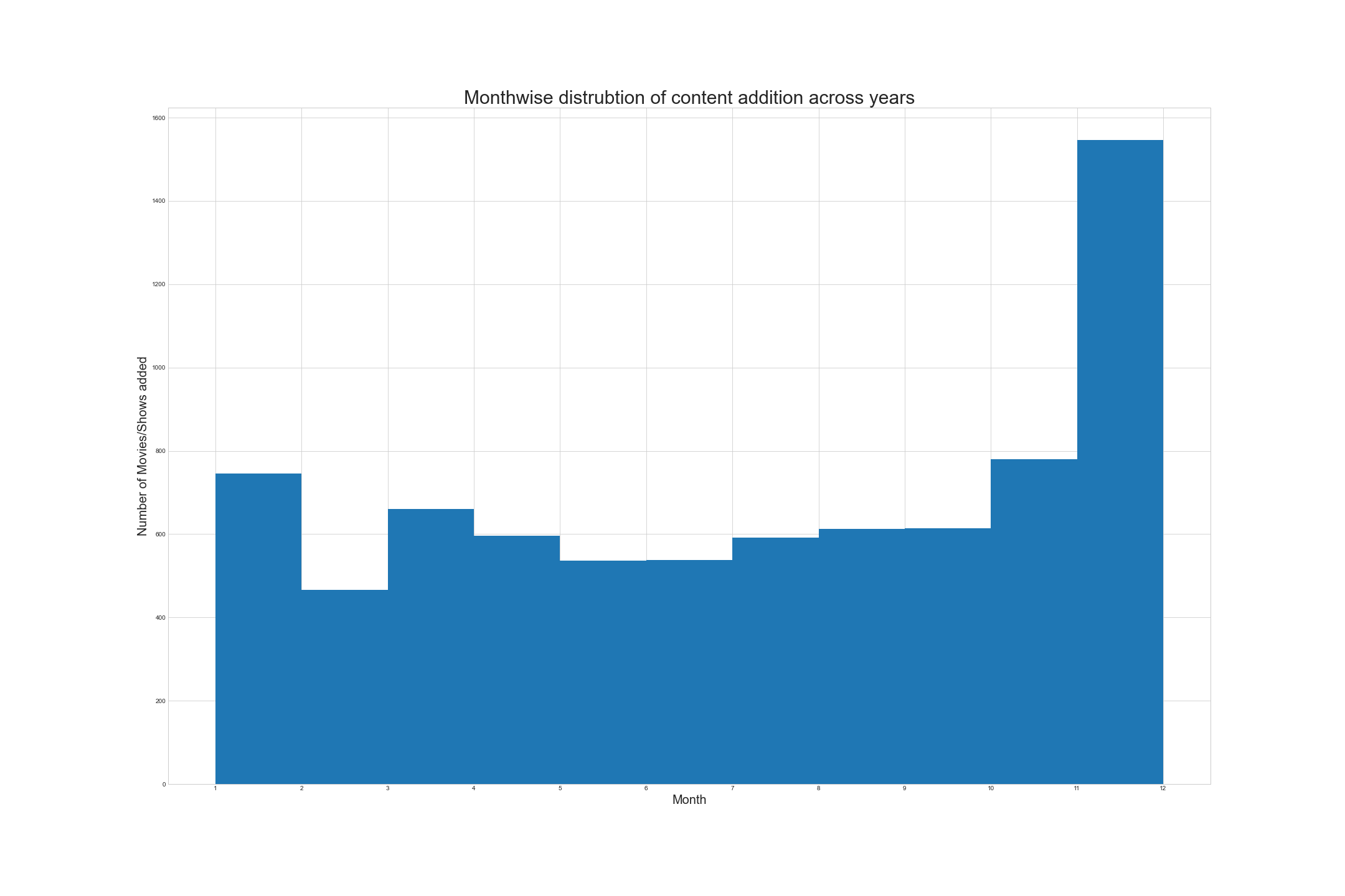
The content addition is at it’s peak in January and December across years
Monthwise distribution visualization
Show/Movie type feature analysis with respect to year_added feature
Addition of tv shows is higher compared with movies from 2011. 57%, 46%, 67% more tv shows are added in the past three years compared with movies.
Tv shows/Movies distribution visualization
Plot details
(year, 0) - Movies (year, 1) - TV shows –> X-axis
Number of Movies/TV shows –> Y-axis
No Of Countries feature analysis with No of Movies/TV shows across years
Case 1: Outliers
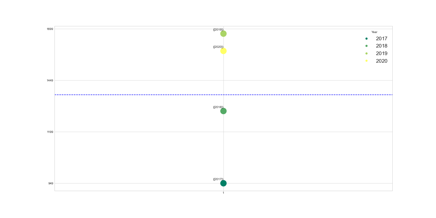
There are four outliers, i.e new content added from 2017 - 2020. Large number of Movies/TV shows were added with minimum 949(2017) to maximum 1676(2019). This outlier is visualized seperatley for better understanding.
Tv shows/Movies distribution visualization associated with countries across years - Outliers
Case 2
From 2015, addition of new content not associated with any country has increased. More than 100 new content were added from 2018 - 2020 with maximum of 158 in 2020.
New content associated with 1 and 3 countries have scatter in a similar manner across years. But a gradual increase in 3 countries and in an erratic manner in associated with 1 country - 61(new content) in 2015 to 1(new content) in 2016 and then more were added only in 2021(81).
Associaton with 3 countries have the highest number of added contents in cumulative sum, mimimum of 137(2017) to 214(2109).
All others are scattered below mean addition of new contents.
Tv shows/Movies distribution visualization associated with countries across years
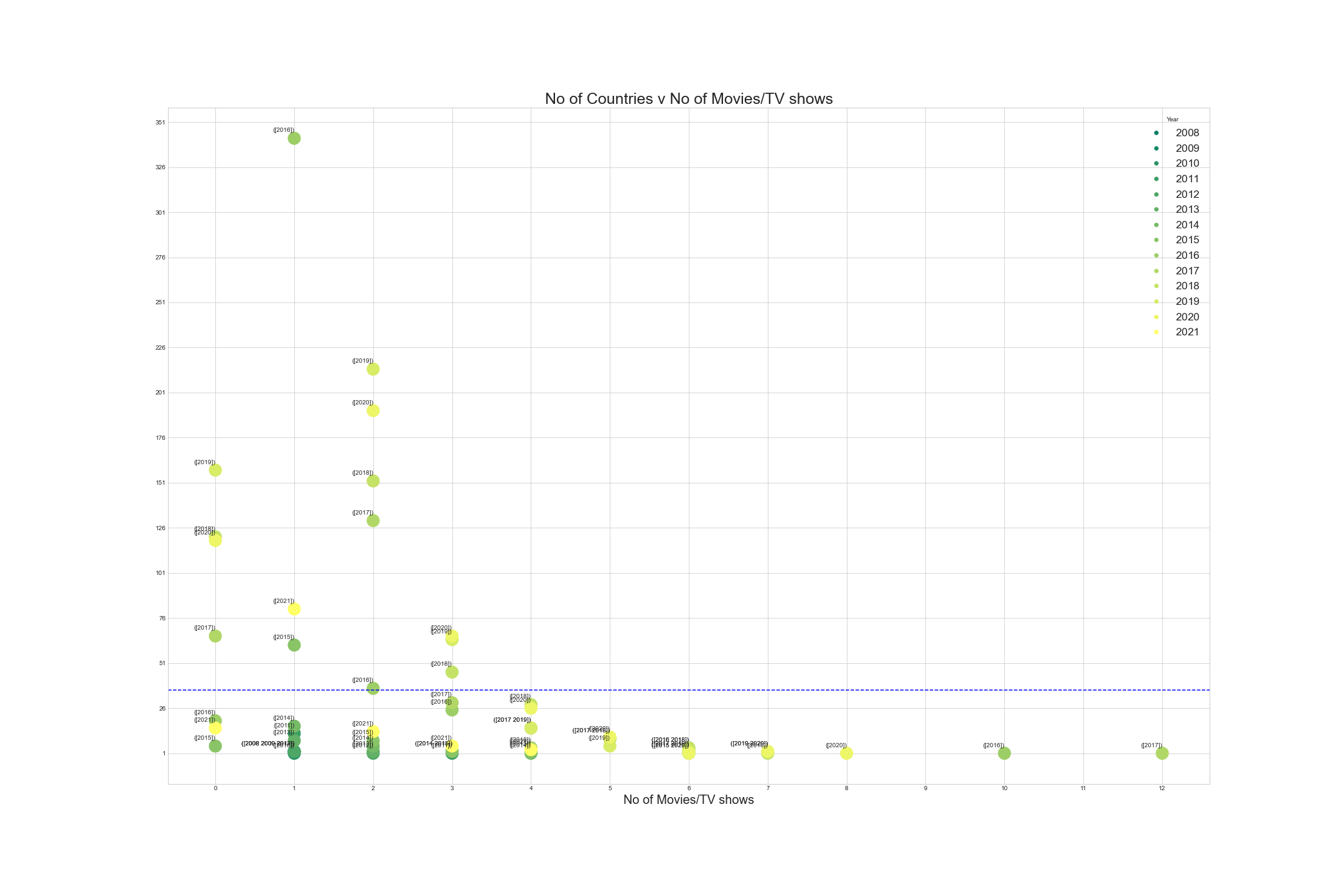
Tried to convert the ndarray to comma seperated values in plot, will find the solution and update the plots later😉
That’s it for this blog, hope you had a good read!! 😎🙂